The brand identity and website of a multidisciplinary clinic in Granby: a one-line logo, neutral colours and a site that leads every visitor to the right care, then to booking.
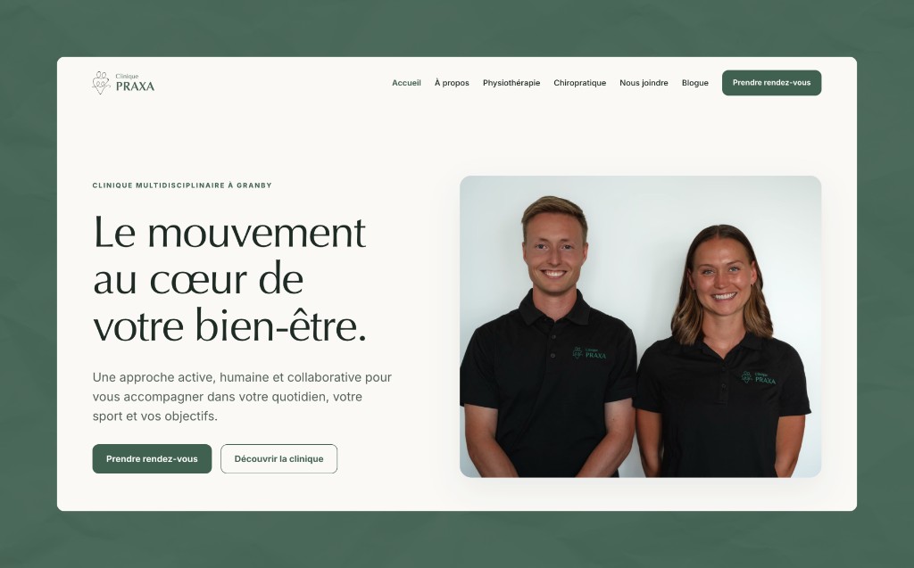
The homepage: the promise of movement, the two services and online booking.
The mandate
Dr Guillaume Moisan, chiropractor, and Camille Bourdeau-Marcil, physiotherapist, were back from two years in a remote region to found their clinic in Granby. At the start, almost everything had to be invented: a still-preliminary name, no online presence, and for the logo, a single image found on Pinterest, unusable as is.
The mandate: build the brand identity then the website, in service of high-quality care, grounded in evidence and trust, for the active families of Granby.
The identity
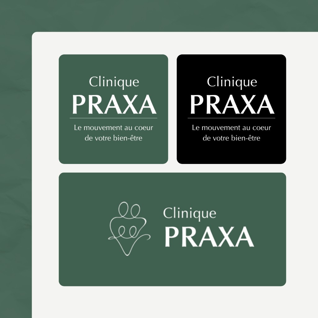
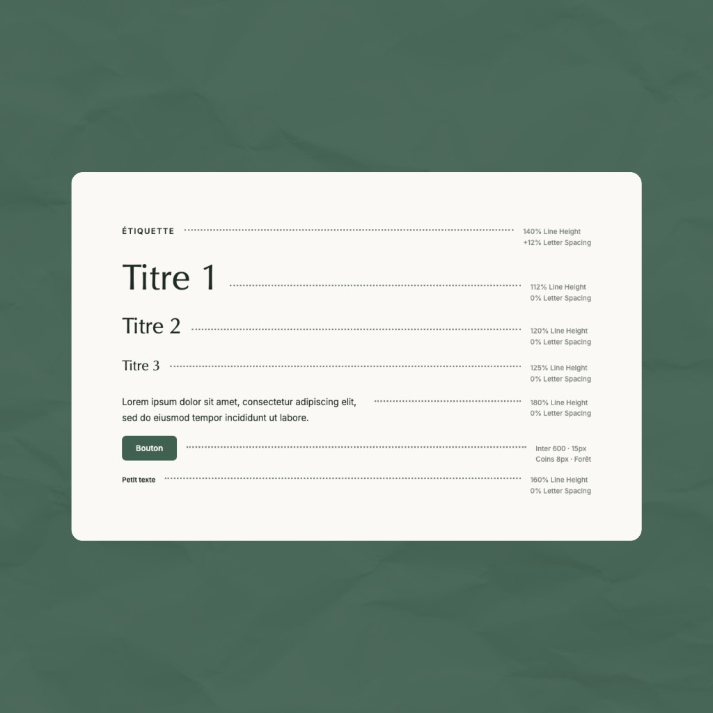
The brand identity comes down to three moves: a one-line logo gathering silhouettes, forest green on a light background, and an editorial serif setting the tone.
The logo lockups: stacked and horizontal versions.The type scale: editorial serif, Inter and the forest-green button.
The website
The site extends the identity without noise: light background, hero centred on movement, a simple presentation of physiotherapy and chiropractic, then the clinic's approach and a direct call to book.
Launch got the same care. I set up hosting and domain emails, reviewed biographies and service descriptions with the founders, and checked every wording against professional order rules. Exact titles, no promises of results. The homepage leads with what patients look for first: opening hours, contact details and booking, plus the clinic's welcoming note. No receptionist, but a callback during the day.
Built with Astro, the site loads fast and stays readable on mobile and desktop alike.